

A paper on the migration of Barn Swallows has been published Open Access in the journal Birds. Publication date was 9 September 2025. The authors, title and journal reference are
Underhill LG, Remisiewicz M 2025. Arrival and peak abundance of Barn Swallows Hirundo rustica in three regions of South Africa in relation to climate indices, deduced from bird atlas data. Birds 6: 48. https://doi.org/10.3390/birds6030048
You can find the paper here or if you would like to go directly to the pdf version, it is here.
In the paper we discuss the way in which the arrival and peak abundance of Barn Swallows in South Africa are influenced by large-scale climate indices in the areas in which they breed, the areas in which they prepare for migration and in areas along the migration flyways.
We, in this case, are Magda Remisiewicz and myself. Magda was a post-doctoral research fellow in UCT’s Animal Demography Unit from 2008 to 2010. She now heads the Bird Migration Research Station at the University of Gdańsk in Poland and has recently been appointed professor at this university. Part of the formalities in being appointed a professor at a Polish university is to be congratulated by the national president:

The data analysis for the paper uses Barn Swallow records on SABAP2 checklists collected at the three main centres where the most atlas data has been collected: the area around Cape Town, called Greater Cape Town in the paper; the area around Johannesburg and Pretoria, Greater Gauteng; the area around Durban, Greater Durban. For each of these regions there are lots of checklists for every one of the 17 years between 2007, when SABAP2 started, and 2023; we stopped then because we did the analyses for the paper in 2024. In this blog, we focus on the results for Greater Durban.
Calculating how early or late the Barn Swallows are each year …
We started the analysis by combining the data for all 17 years for each region, and produced a curve which showed how reporting rates increased on average during the arrival periods in each region. Here is the plot for Greater Durban:
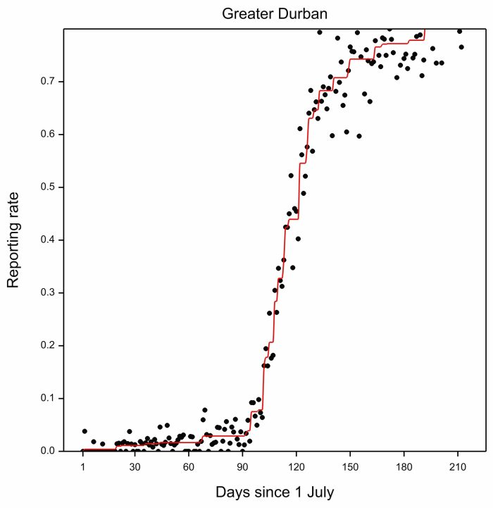
The black dots are the daily reporting rates in the Greater Durban area from 1 July. So the dot for 1 July would use the SABAP2 checklists made on 1 July in all 17 years (2007 to 2023). It is clear that the period of the most rapid increase in reporting rates runs from about Day 100 (i.e. 100 July) to around Day 130 (i.e. 130 July, known to most people as between 8 October and 7 November). The rate of increase of reporting rate then slows down, and flattens out by about Day 190 (i.e. 190 July = 6 January).
It is encouraging to see how well-behaved the pattern of daily reporting rates is. At the end of the day, that is a huge accolade to the quality of the atlasers.
The red line in the plot above is constructed using a technique called monotonic regression, which hugs the reporting rates as closely as possible, while always moving upwards. The red line defines the average timing of migration over the 17 years. For each year we want to find the anomaly of migration timing, ie quantify how early or how late migration was in relation to the long term average. And we want to do this over the whole arrival period. For Greater Durban we used the period between Day 104 and Day 192 as the arrival period (12 October to 8 January)
To calculate the anomaly for a particular year, we calculated the daily reporting rates for that year. Then we fitted the monotonic regression for the year. So for Greater Durban in 2016, the blue line is the line for the year, and the red line is the line for all the years, copied from the image above.
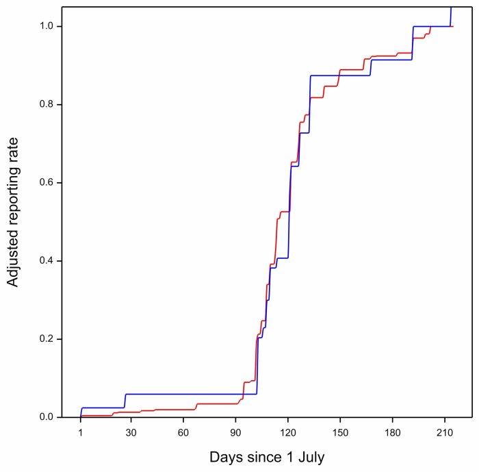
We adjusted the reporting rate curves for the individual years, (and for the multi-year curve) so that they ended at 1.0 in every year. This was done because the maximum reporting rate reached at the end of migration differed between years. In the curve above, for 2016, the red line (the multi-year curve), and the blue line (the 2016 curve) are very similar. The areas of the pieces of the blue curve which are above the red curve more or less balance with the ares of the blue curve below the red curve. In other words, arrival of Barn Swallows in 2016 had a very similar pattern to the overall arrival pattern, and the arrival anomaly for 2016 is small.
… next, have a look at this, the two curves for 2008:
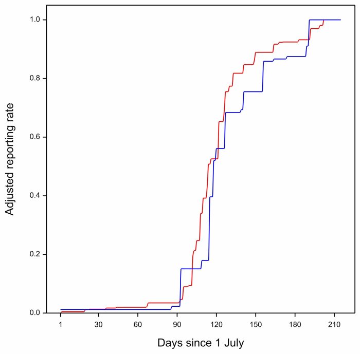
The blue curve for 2008 is mostly to the right of the red multi-year curve. The Barn Swallows are late, and the anomaly is positive. In all of these plots the red curve is identical. It is the blue curve that represents arrival in a particular year and is different in each plot.
… and here is the curve for 2021:
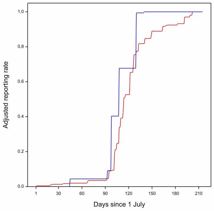
The blue curve for 2021 is mostly to the left of the multiyear curve. Arrival is early. The anomaly for 2021 is negative.
When you calculate the anomalies for Greater Durban for every year, and produce a plot with year on the x-axis and with annual anomaly on the y-axis, it looks like this:
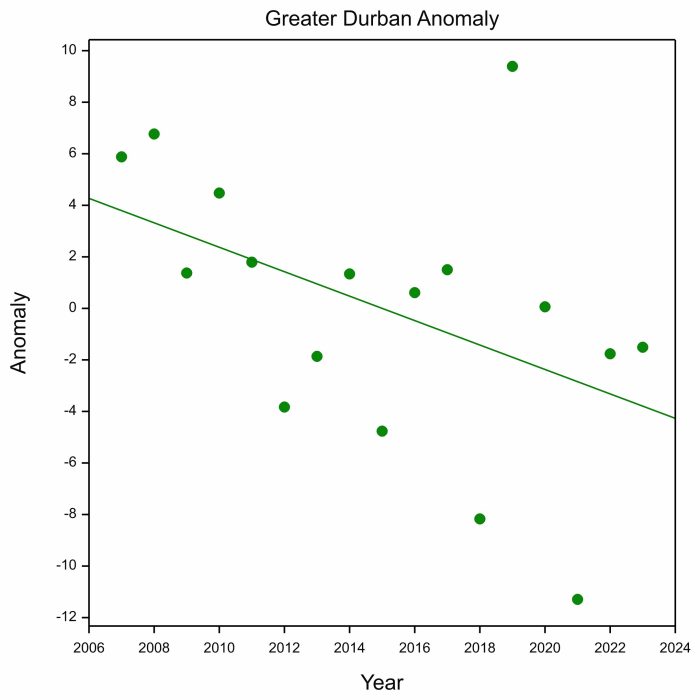
The astonishing thing is that the scatter of points is not random, they point downwards. In the early years of SABAP2, the annual anomalies were mostly positive, and towards the end they were mostly negative. When the anomaly is positive, arrival is late, and when it is negative, it is early. So the downward trend in the plot above is saying that the arrival of Barn Swallows has trended earlier in KwaZulu-Natal during the SABAP2 period, 2007 to 2023.
The next result was even more surprising. These annual anomalies were positively correlated with a climate index called the Scandinavian Pattern. We used the average value of the Scandinavian Pattern during the breeding season of the Barn Swallows, the period May to August. Positive values for the Scandinavian Pattern are related to warm and dry conditions in northeastern Europe and western Asia, the breeding area of a large proportion of the Barn Swallows migrating to the Greater Durban region (we know this from ring recoveries). Favourable breeding conditions probably increase the breeding success of Barn Swallows, which can raise two broods. The adults with second broods, and the juveniles from them, will tend to migrate later than in years when conditions are cold and wet when the Scandinavian Pattern is negative. So the positive correlation between the timing of arrival on migration and the Scandinavian Pattern during the previous breeding season is eminently plausible.
Peak annual reporting rates …
One of the things we discovered was that the reporting rates climbed to different values after each arrival year. So we computed the annual peak reporting rates for Barn Swallows for a given year as the median of the reporting rates during the midsummer period between 11 and 31 January of the following year. So the peak reporting rate for 2007 is based on the reporting rates for the three-week period between 11 and 31 January. We chose this period because reporting rates had stopped increasing by 11 January, and had not started decreasing by 31 January. So the plot below shows peak annual reporting rates for Greater Durban:
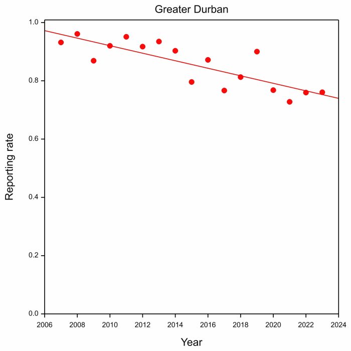
The results are alarming. They show a steady decrease in reporting rates from above 90% in the early years of SABAP2, to below 80% in recent years.
What are the take home messages?
The paper is packed full of results like this, relating to the arrival and peak abundance of Barn Swallows. Its main message is that the southward migration of Barn Swallows and the timing of their arrival at their southernmost non-breeding destinations are influenced by the big climate indices, and by temperature and precipitation across the breeding range and along the migration routes. The climate variables that show correlations make sense in relation to the known breeding areas and migration routes to the three destination regions.
The paper demonstrates the potential of the Second Southern African Bird Atlas Project (SABAP2) as a long-term annual monitoring project for birds. The particular strengths are its strong protocol, which enables the analysis undertaken here, and the fact that, unlike most monitoring projects, it enables monitoring to be done both in space and time. We recommend the indefinite continuation of the SABAP2 project, which with time, will provide more insight into changes in birds’ distribution and timing and their response to climate change not only in South Africa, but also on the breeding grounds and along migration routes. This might be the first paper to use SABAP2 data on an annual basis.
Sister papers
This new paper has four “sister” publications, based on bird ringing done at the bird observatory at Bukowo, on the Baltic Sea coast in Poland. All of them are Open Access, Click on the journal reference to get the paper.
Remisiewicz M, Underhill LG 2020. Climatic variation in Africa and Europe has combined effects on timing of spring migration in a long-distance migrant Willow Warbler Phylloscopus trochilus. PeerJ 8: e8770. This paper has a blog.
Remisiewicz M, Underhill LG 2022a. Large-scale climatic patterns have stronger carry-over effects than local temperatures on spring phenology of long-distance passerine migrants between Europe and Africa. Animals 12: 1732.
Remisiewicz M, Underhill LG 2022b. Climate in Africa sequentially shapes within-season spring passage of Willow Warbler Phylloscopus trochilus through the Baltic Coast. PeerJ 10:e12964.
Remisiewicz M, Underhill LG 2025. Climate in Europe and Africa sequentially shapes spring passage of long-distance migrants at the Baltic coast in Europe. Diversity 17: 528.
These four papers deal with northward migration. The new paper deals with southward migration.
There is a full list of all publications with BDI authors here