
A bird atlas contains maps about birds, usually their distribution, and also text and graphics that helps to interpret the maps.
There are two characteristics you can expect in a bird atlas: (1) the information will be based on data collected by citizen scientists during a coordinated “bird atlas project”; (2) the maps will use a grid.
The citizen scientists do fieldwork according to a protocol developed by the atlas coordination team. In most atlas projects the fieldwork consists of making a list of bird species within a grid cell. The lists are captured into a computer. The computer sorts the list of species for the grid cell into a list of grid cells for each species. To generate a map for a species, the grid cells in which the species was recorded are shaded, and the grid cells in which the species was not recorded are left blank. This can be called a “presence-absence map”:
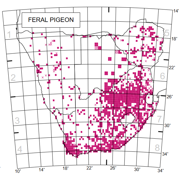
This was the distribution map for the Feral Pigeon in the First Southern African Bird Atlas Project, published 1997. It is almost a presence-absence map. Some of the grid cells have crosses in them; in these grid cells the species was rare.
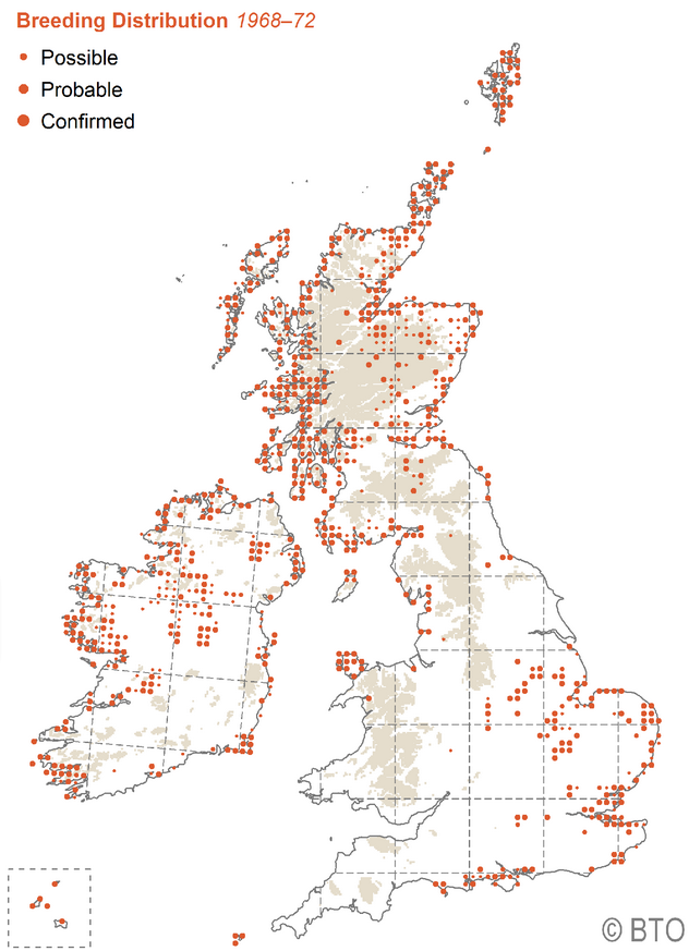
In some atlas projects, the protocol requires the citizen scientists to restrict the map to species which are breeding. Then the maps are a breeding atlas, showing the places where the species is known to breed. We have never done a breeding atlas in southern Africa, so we need to look to The Atlas of Breeding Birds of Britain and Ireland. This map shows the grid cells in Britain and Ireland in which Common Terns Sterna hirundo were breeding in the period 1968 to 1972. Instead of simply shading the entire grid cell, there are now circles in each grid cells, of three sizes, to represent the certainty with which the species had been recorded breeding in the grid cell.
This particular atlas project was chosen to illustrate the concept of a breeding atlas for two reasons.
Firstly, it revolutionised the study of bird distributions. This was the first bird atlas project ever to map the breeding distribution of all bird species at a national level. It was produced by the British Trust for Ornithology (BTO) and the Irish Wildbird Conservancy. This atlas was the catalyst for similar projects worldwide.
Secondly, during the northern summer of 1972, the final year of fieldwork for this atlas, Digby Cyrus worked at a bird observatory in the UK, and got involved in this fieldwork. When he got back home, to Pietermaritzburg in South Africa, he motivated for the start of a local bird atlas. So that first-hand experience of atlas fieldwork led rapidly to an initiative to do a bird atlas in what was then Natal, published in 1980 (Cyrus & Digby 1980), only four years after the atlas of Britain and Ireland was published (Sharrock 1976). Digby brought the concept of the bird atlas to Africa. The idea reached tipping point and took off. Soon there were atlas projects on the go in other provinces, and in 1987 the First Southern African Bird Atlas Project (SABAP1) started, a super-ambitious project involving six countries: Botswana, Lesotho, Namibia, South Africa, Swaziland (new Eswatini) and Zimbabwe. SABAP1 revolutionised our understanding of bird distributions in southern Africa. For example, look at this map for the Red-billed Oxpecker, produced from data collected mainly in 1987 to 1991:

This distribution map shows the impact of so-called “purple-label” cattle dips. These contained arsenic. These dips killed the ticks that fed on the cattle, but they also killed the oxpeckers that fed on the ticks! These dips were used by farmers in northern South Africa. In Botswana the cattle were not dipped. So the distribution of the Red-billed Oxpecker closely followed the political boundary. Likewise, there is a massive contrast inside and outside of the Kruger National Park in northeastern South Africa. Neither of this boundaries represents any form of ecological barrier. The “purple-label” dips are no longer in use, and have been replaced by oxpecker-friendly “green-label” dips, and the distribution of this species has slowly expanded back into the areas from which it was largely exterminated.
The SABAP1 maps represented a huge advance on the distribution maps in the fieldguides at the time. Very few species came through with the distribution maps unscathed, and the subsequent editions of the fieldguides all had to adjust their maps to take into account the “truth” generated by about 5,000 citizen scientists. They contributed 148,000 checklists, and submitted a total of 7.3 million records of bird distribution
The SABAP1 maps also represented a major advance on simple presence-absence maps. The maps have three shades of red, which represent the reporting rate, effectively the commonness of the species in each quarter degree grid cell. The darkest shade show the areas where the species really wants to be, the core of the range; the lightest shade represents the periphery of the range, where the species occurs less commonly. There is an intermediate shade as well, where the species quite likes to be! The grid cells with X’s indicate where the species has been recorded rarely, most frequently as a vagrant, with just a single sighting over the five years of SABAP1 fieldwork.
References
Cyrus DP, Robson NF 1980. Bird atlas of Natal. University of Natal Press, Pietermaritzburg.
Sharrock JTR 1976. The atlas of breeding birds in Britain and Ireland. T & AD Poyser, London.