
The map below shows coverage for OdonataMAP. There are records for only 1,101 of the 2,014 grid cells of South Africa, Lesotho and Swaziland. That’s a little over half, 54% to be exact. And the table above the map tells us that only 182 grid cells have 103 or more records of dragonflies and damselflies! It is no wonder that we have been so shrill in encouraging all the OdonataMAPpers to submit their records. We have worked hard encouraging everyone with a photo of a dragonfly to submit it to the OdonataMAP section of the Virtual Museum. We have run monthly “Shoot the Dragons Weeks” through the summer months for the past couple of years. But we have a long, long way to go before we can come anywhere close to complete coverage and can make accurate distribution maps for all species.

We can’t wait forever to get distribution maps for species. We need them NOW. Conservation managers need to know where species occur, and where the most valuable sites for the conservation of dragonflies and damselflies are. Here is the Virtual Museum distribution map for a common dragonfly, the Orange-veined Dropwing Trithemis kirbyi.
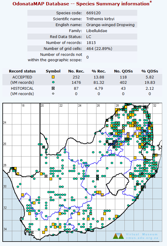
The table above the map tells us that there are an incredible 1,476 photographic records of this species in the Virtual Museum, and that there are another 252 records that come out of the ADDO database. But the map is still pretty spotty. It is clearly full of what, in the biodiversity mapping trade, are called “false negatives”. These are all the places in which the species does occur, but which no OdonataMAPper has yet visited! What this map shows is the grid cells in which Orange-veined Dropwings have been reported. It is a presence-absence map. No attempt is made to show whether the species is common or rare. We cannot tell from this map whether or not a large proportion of the records at a site are Orange-veined Dropwings. So this map has lots of deficiencies, but the most important of these is that it is stuffed alarmingly with “false negatives”.
What are we going to do about this? This is the point at which some judicious statistical modelling comes to the rescue. There are dozens and dozens of “species distribution models” which have been invented to crack this problem. It is important to say this at the outset. Statisticians-in-training get taught: ALL MODELS ARE WRONG; SOME ARE USEFUL. In spite of this, lots of statisticians actually have a deep belief that their models show the truth. And many of the biologists who use statistical models have almost religious faith in their modelling.
So the map below is the output of a statistical model that purports to show the actual distribution map of the Orange-veined Dropwing. It is based on both the two maps above. The computer algorithm (ie the programme) makes use of the actual points at which Orange-veined Dropwings occur, but it also makes use of the overall database contained in the first map. So every single record in the OdonataMAP database has influenced this map to a greater or lesser extent. 
The first thing you have to note about this new distribution map for the Orange-veined Dropwing is that you have to imagine the coastline and the borders of South Africa, Lesotho and Swaziland. This is a draft and tentative map. Secondly, it is a model, so it is definitely not right. It is over to you to assess whether it is a useful “model” of the overall distribution, i.e. a distribution without the false negatives.
This distribution map looks astonishingly different from the presence-absence map above. For example, it is now shown to occur all over the arid northwestern parts of South Africa, especially the Northern Cape. KwaZulu-Natal seems to get down-played. What is going on? Amazingly, the new maps seems to be getting it right. A bit of detective work discovers that although coverage of the northwestern areas of South Africa is poor (this can be seen in the top map), a large proportion of the Odonata that occur here are of this species. Examining the date for Limpopo, Mpumalanga and KwaZulu-Natal reveals the opposite. The top map shows that there is lots of data for many grid cells in these provinces. And many grid cells have records of Orange-veined Dropwing. But they form quite a small proportion of the total. So they are down-played. Time will tell whether the modelled map comes close to the truth. It certainly provides new insights into the distribution of this species.
Why does the map for the Orange-veined Dropwing have three colours? There is lots and lots of orange. There is some light brown, and there is some dark brown. The clue to this is in the map below, called the “Baseline” map.

This is the computer algorithm’s version of the top map, showing overall coverage. In the grid cells in this map which have large circles, the new distribution maps are well-supported by the OdonataMAP data (and the circles in the species map are dark-brown and ought to be pretty reliable). Where the circles in this maps are tiny, the modelled distributions might be unreliable (and the grid cells are shown in orange), and the light-brown circles are intermediate.
There is lots of orange in the new map for the Orange-veined Dropwing. So the distribution across the Northern Cape is acknowledged by the model to be speculative.
The strategy for getting rid of the orange, and the speculation, is simple. We need more data from these regions. Looking at the “Baseline” map, it is clear that, besides the northwest, there are areas within the northern provinces that need data too!! We’ll unpack this more over the next few weeks.
In the meantime (this is written on 19 September 2019), we are desperately waiting for rain across the summer-rainfall region of southern Africa. The drought is currently so bad that there are hardly any dragonflies (or for that matter butterflies) in evidence. The OdonataMAPpers, and the LepiMAPpers, are having a hard time.
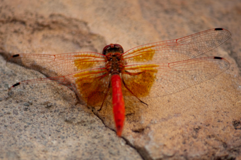
And, finally, here is a photo of the species that has been the topic of this blog, the Orange-veined Dropwing.

It was photographed by Riette Griesel at the Garingboom Guest Farm in the Free State. It is curated in OdonataMAP at http://vmus.adu.org.za/?vm=OdonataMAP-956.