

Traditionally, we have used the quarter-degree grid scale to generate distribution maps in biodiversity atlases. In southern Africa, this convention started with the Bird Atlas of Natal, published in 1980, four decades ago. There is no explanation in the book as to why Digby Cyrus and Nigel Robson, the project team and co-authors, chose this grid scale. It was adopted by almost all subsequent biodiversity atlas projects.

This blog explores a range of alternative grid scales. But, as distribution maps go, it is a restricted range. These are all simple presence-absence distribution maps for the butterfly species, Common Dotted Border Mylothris agathina, featured above. If this species of butterfly was recorded anywhere within a grid cell, the grid cell is shaded. The species might have been recorded only once, or multiple times; this is not shown in any way. If the species was not recorded, the grid cell is not shaded. These maps do not attempt to show relative abundance. They are analogous to the “on-off” distribution maps in field guides, which are generally reproduced at much the same size as postage stamps.
The blog steadily works its way inwards from two extremes. The first map presented uses a 60 minute grid and the second uses a one minute grid. Then it goes to 30 and three, etc.
 This is the distribution map for the Common Dotted Border, on a one-degree grid scale (or 60 minutes). If the species was recorded at least once, anywhere within the grid cell, it is shaded. (If there is a photographic Virtual Museum record, the grid cell is shaded green; if there are only specimen records, the shading is dark grey.)
At first glance, the next map looks blank. You need to look at it carefully. The distribution of the Common Dotted Border is shown on a one-minute grid:
This map, using the one-minute grid, is essentially marking the exact points at which Common Dotted Borders have been recorded. But the individual dots are so small that, unless there is a cluster of them, they are hard to see. Below is the one-minute grid scale map for just KwaZulu-Natal. With this enlarged map, the individual points are visible.
Do either of these maps give an accurate impression of the “truth”? In this case, the “truth” is the overall set of places where this butterfly occurs. The one-minute grid in KZN represents “truth” in the sense that this species has occurred in every one of these tiny grid cells (assuming of course that they have been accurately documented). But we also know that, if we went and looked for it, we would find this species in many (or even most) of the little gaps between the points where it has been seen and reported. In technical terms, the one-minute map is riddled with false negatives, places where the species does occurs but where it has not (yet) been recorded. So, although the one-minute grid cell map is telling the truth, it is not telling the whole truth! It does not show all the places where the species occurs.
The trick now is to argue that if a species is recorded at a point, it probably also occurs in the “neighbourhood” of that point. But as soon as we start implementing this gimmick, we introduce false positives. These are places where the species does not occur, but where the distribution map shows it as present. On the grid maps we are considering in this blog, “neighbourhood” is defined in a precise way. Every point belongs to a grid cell, and that grid cell is its “neighbourhood”. If we define neighbourhoods in this way, using a one-degree (60-minute) grid, then just a single record within the grid cell results in the entire degree square being shaded. In the KwaZulu-Natal map, there is only one record of Common Dotted Border in degree cell 2730 (which has 27°S and 30°E in its northwest corner). This is the cell that straddles the border between KwaZulu-Natal and Mpumalanga. This record is on the eastern edge of the one-degree cell. On the map above with the one-minute grid, the “neighbourhood” of the point, the one-degree cell 2730, is shaded. This strategy undoubtedly introduces false positives. Defining the “neighbourhood” as a whole degree cell is just too big.
Let us step down to a 30-minute grid (or we could talk about a half-degree grid cell, but grasp that there are four half-degree grid cells in a one-degree grid cell):
The general impression given by this map is of a species with a continuous distribution. Lots and lots of gaps between individual records have been filled in. The species is now characterized by having a distribution through most of the savanna in the north and along the southern coastal areas, continuing northwards along the west coast to about Velddrif and the estuary of the Berg River. There might be lots of false positives, with the “neighbourhood” system pushing the species into areas where it does not occur. At the same time, there are unlikely to be any false negatives! If the distribution of the Common Dotted Border really is continuous, this map might not be far from reality!
The map below is on a three-minute grid. With the map produced at this resolution, the points of occurrence of the Common Dotted Border are now easily visible.
Like the one-minute grid, this map clearly also suffers from false negatives. The true distribution is certainly far more “continuous” than this. It is not clear whether the areas with intriguing patterns of records (such as across Limpopo and Mpumalanga in northern South Africa) are due to “biological factors” or “distribution of citizen scientists”. It is possible to disentangle these factors, and for many serious researchers this map would be fascinating. They would be looking at in conjunction with maps showing relief, vegetation types and human population density.
Next up is the traditional map, made on a fifteen-minute grid, also known as the quarter-degree grid:
Compared with the distribution map on the 30-minute grid, this map is beginning to suggest a somewhat fragmented distribution. Look, for example, at the distribution in the savanna regions of Limpopo and Mpumalanga. The gaps are not random, but seem to occur in patches. By looking at this map, we cannot tell whether these are real, or represent regional variation in observer effort.
Here is the distribution map made with a five-minute grid. This is the grid scale in use by the Second Southern African Bird Atlas Project, where the cells are known as pentads. There are nine pentads in a quarter-degree grid cell. 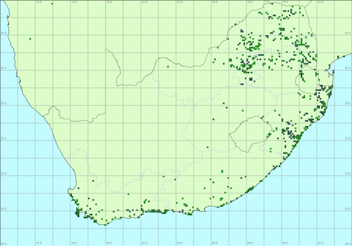
The pentad scale probably keeps the impact of false positives to a manageable level. But most people would look at this and say: “With a bit of effort, a lot of the little gaps could be covered.” So there are false negatives too. Maybe, this choice of grid represents a balance between the false negatives and the false positives.
The Appendix to this blog presents maps on a few more grid scales.
There are many other strategies for producing maps. But that is a topic for another blog. For example, you could put a circular disc around each point and define “neighbourhood” in this way. Define the distribution as the total area covered by discs. You can then experiment with what happens when you vary the diameter of the disc. There are also families of statistical methods, which use “explanatory variables” such as altitude, rainfall and temperature. These methods try to uncover the ranges of values of these variables at the points where the species occurs, and then extrapolate the distribution to the full set of points with these values for the explanatory variables. The bottom line is that no matter what you do, you end up with false positives and false negatives.
This has been a fascinating blog to produce. We have not done exercises like this before, and I had no idea which grid cell would be the “best” choice. The reality is that it is impossible to choose. To make a choice, we would need to know the true distribution. But that is precisely what we are trying to find!
This exercise has been done on a single species. So this is a sample of size one, an anecdote, and it is dangerous to draw conclusions from an anecdote. We would probably need a sample of at least 20 or 30 carefully chosen species. The species should be chosen by lepidopterists who know the species from fieldwork experience. One of the main criteria would be to select a range of species, from species with distributions known to be near-continuous to those with highly fragmented distributions.
The choice also depends on the application for which you need the distribution maps. Your selection depends on whether you are the author of a field guide (and need a simple map), a biogeographer or macroecologist (and want to look at patterns of distribution on a continental scale), a Red List evaluator (and require an estimate of the area of the range of the species so as to allocate a threat status) or an environmental impact assessor (needing to know whether a species occurs at a particular plot of land earmarked for development). There are many other categories of users who all have specific desires for their distribution maps.
Finally, this exercise has also been a bit unfair to the Virtual Museum data. The data were assembled with mapping at a quarter-degree grid in mind. It is a bit shabby now to plot maps at finer scales, but it is interesting that quarter-degree grid patterns are not in evidence at all.
Perhaps the take-home message for Virtual Museumers is this. Please do not hesitate to submit repeat records for a species in the same quarter-degree grid cell, but try to get them spread over the grid cell.
Appendix
And just for completeness sake, here are maps at a series of intermediate grid scales to those presented above.
10 minute grid:
20 minute grid:
40 minute grid:
And finally, here is the distribution map at the two minute grid:
Overall, in this blog, maps have been presented at these grid scales: 1, 2, 3, 5, 10, 15, 20, 30, 40 and 60 minutes.